A long time ago, perhaps in my college’s math deparment computer lab, I recall someone mentioning that boxplots could give you an intuition for t-test results. The intuitive rule was:
If a set of boxplots overlaps then there is no statistical difference between the two samples. If the boxplots do not overlap then perhaps there is a statistically significant difference.
For whatever reason, probably because I am a visual learner, this intuitive rule has stuck. Setting aside the obvious problems around formulating a hypothesis and threshold, I became curious as to whether this intuitive rule was correct, semi-correct, helpful, or flat out wrong.
Am I a sucker if I use boxplots as a statistical shortcut for comparing groups? Does the intuition here present any “gotchas”? Any scenarios where the intuition and the actual result of a hypothesis test are vastly opposed? Why do no stats articles online that introduce tests use boxplots to create intuition??
To answer some of these questions I decided to run some simulations. (Ok actually I decided to Google, but surprisingly I didn’t find any great articles on this topic?!) I also briefly contemplated if this boxplot/p-value relationship could be derived mathematically… but to Professor Navidi’s dismay I gave up pursuing that path before writing a single equation down.1 I love simulations because they are easy. No messy data. You control the “real” answer. Such a relaxing contrast to real data science or, even messier, engineering management!
In this post I present a few results along with my hot-takes. I am hoping the twitter stats hive mind can weigh in and set me straight. Come on you PhDs, set this grad school dropout straight!
A final, unrelated question - does anyone know how to create a boxplot on large data? Is there an efficient boxplot “map-reduce” alogrithm? Update: this SO thread basically has the answer!
population_plot <- function(x,y){
  tibble(
    data = x,
    dist = "x"
  ) %>%
  rbind(
    tibble(
      data = y,
      dist = "y"
    )
  ) %>%
  ggplot(.) +
    geom_density(aes(x = data, fill = dist), alpha = 0.3)
}

add_samples <- function(pplot, x_samples, y_samples) {
  samples_df <- tibble(
    data = x_samples,
    y_coord = 0.05,
    dist = "x"
  ) %>%
  rbind(
    tibble(
      data = y_samples,
      dist = "y",
      y_coord = 0.1
    )
  )
  pplot +
    geom_jitter(data = samples_df, aes(x = data, y = y_coord, color = dist)) +
    labs(
      x = NULL,
      y = NULL,
      fill = "Distribution",
      color = NULL
    )

}

boxplot <- function(x_samples, y_samples) {
  samples_df <- tibble(
    data = x_samples,
    y_coord = 0.05,
    dist = "x"
  ) %>%
  rbind(
    tibble(
      data = y_samples,
      dist = "y",
      y_coord = 0.1
    )
  )
  ggplot(samples_df) +
    geom_boxplot(aes(x=data, fill = dist)) +
    theme_minimal() +
    labs(
      x = NULL,
      y = NULL,
      fill = "Distribution"
    )
}
Normal
I decided to start by simulating normal distributions.
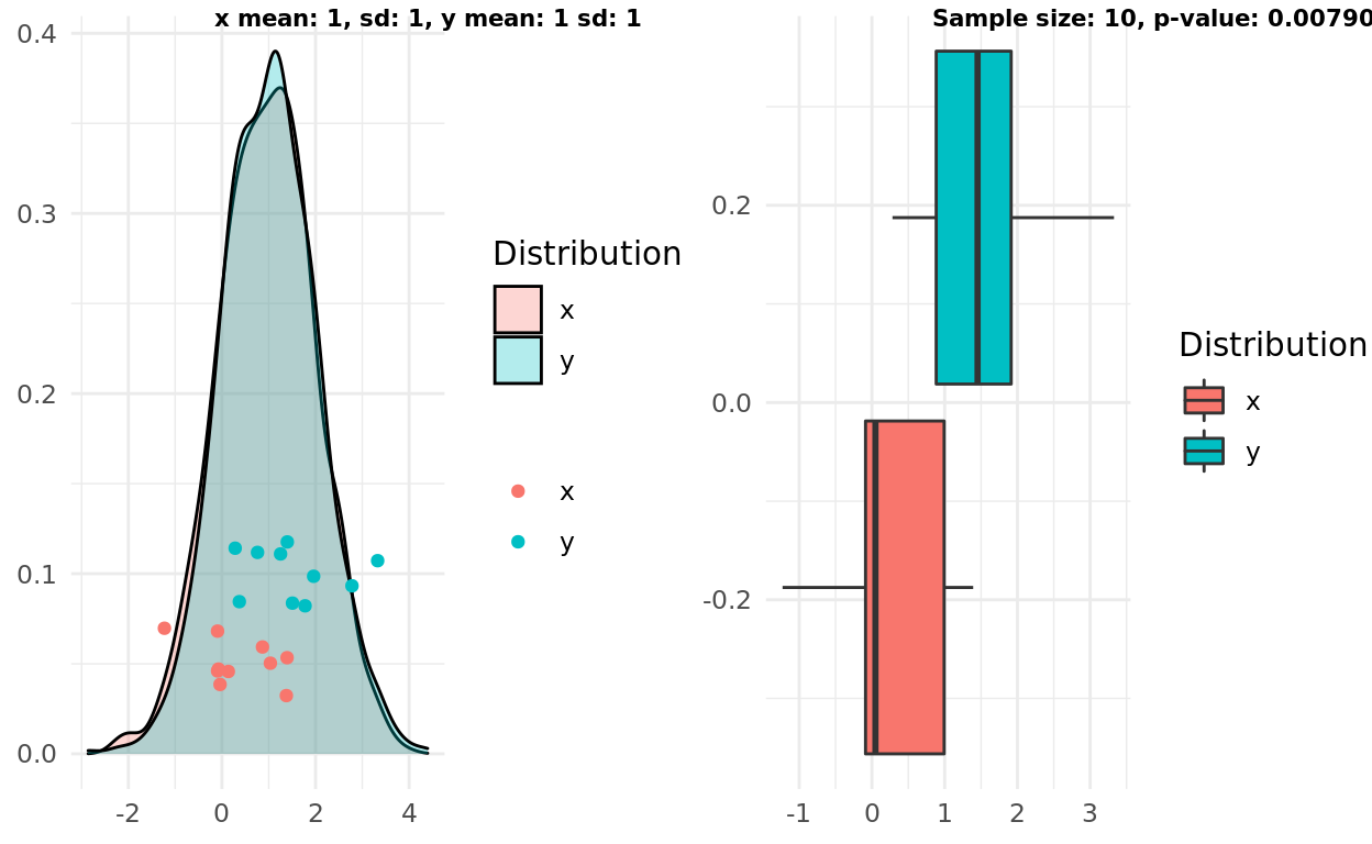
Two normal distributions, same mean, small variance
My first simulation presents a good example of “boxplot overlap”, where the alternative hypothesis that the samples come from different distributions would not be supported. In other words, high overlap, large p-value.
x_mean <- 1
y_mean <- 1
x_sd <- 1
y_sd <- 1
x <- rnorm(1000, mean = x_mean, sd = x_sd)
y <- rnorm(1000, mean = y_mean, sd = y_sd)

n <- 10
x_samples <- sample(x, n)
y_samples <- sample(y, n)

pop <- population_plot(x,y) %>%
  add_samples(x_samples, y_samples)
box <- boxplot(x_samples, y_samples)

test <- t.test(x_samples, y_samples)

label1 = sprintf("x mean: %d, sd: %d, y mean: %d sd: %d", x_mean, x_sd, y_mean, y_sd)
label2 = sprintf("Sample size: %d, p-value: %g", n, test$p.value)
ggarrange(pop, box, labels = c(label1, label2), font.label = list(size = 8))
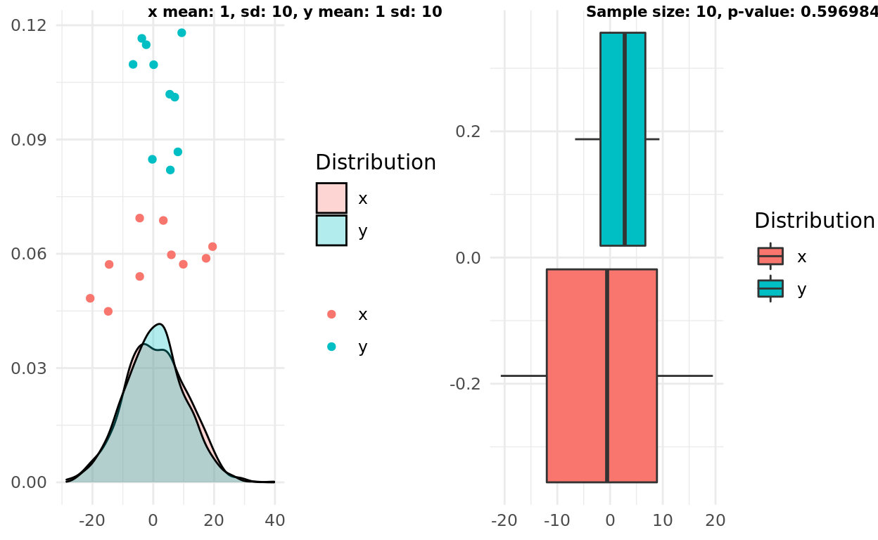
Two normal distributions, same mean, large variance
My second experiment presents a slightly harder “test” by increasing the variance. In this case the boxplots still overlapped, correctly suggesting the two samples come from distributions that are similar enough to reject an alternative hypothesis.
x_mean <- 1
y_mean <- 1
x_sd <- 10
y_sd <- 10
x <- rnorm(1000, mean = x_mean, sd = x_sd)
y <- rnorm(1000, mean = y_mean, sd = y_sd)

n <- 10
x_samples <- sample(x, n)
y_samples <- sample(y, n)

pop <- population_plot(x,y) %>%
  add_samples(x_samples, y_samples)
box <- boxplot(x_samples, y_samples)

test <- t.test(x_samples, y_samples)

label1 = sprintf("x mean: %d, sd: %d, y mean: %d sd: %d", x_mean, x_sd, y_mean, y_sd)
label2 = sprintf("Sample size: %d, p-value: %g", n, test$p.value)
ggarrange(pop, box, labels = c(label1, label2), font.label = list(size = 8))
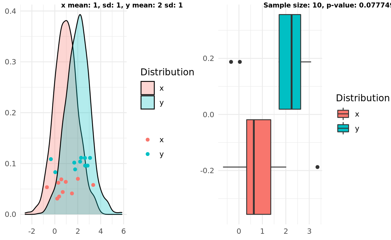
Two normal distributions, different mean, small variance
My third simulation gets a bit more exciting. Does the boxplot intuition hold up if the two samples actually come from different distributions? I decided to start with an easier case where the distributions had different means and small variance. The boxplot rule seems to get this one correct, though interestingly the p-value here would be above a 0.01 threshold.
x_mean <- 1
y_mean <- 2
x_sd <- 1
y_sd <- 1
x <- rnorm(1000, mean = x_mean, sd = x_sd)
y <- rnorm(1000, mean = y_mean, sd = y_sd)

n <- 10
x_samples <- sample(x, n)
y_samples <- sample(y, n)

pop <- population_plot(x,y) %>%
  add_samples(x_samples, y_samples)
box <- boxplot(x_samples, y_samples)

test <- t.test(x_samples, y_samples)

label1 = sprintf("x mean: %d, sd: %d, y mean: %d sd: %d", x_mean, x_sd, y_mean, y_sd)
label2 = sprintf("Sample size: %d, p-value: %g", n, test$p.value)
ggarrange(pop, box, labels = c(label1, label2), font.label = list(size = 8))
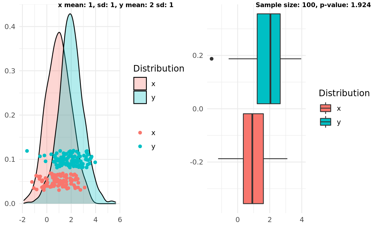
Two normal distributions, different mean, small variance, larger sample size
Repeating the same setup but increasing the sampe size shows the first failure in the intuitive rule.
This time the boxplots do overlap, but the p-value would meet a reasonable threshold and support the alternative (and correct) hypothesis that the samples come from different distributions!
Interestingly, we could refine the intuitive rule a bit and satisfy this scenario. A refined rule might state:
If the median in one boxplot does not overlap with the IQR from another boxplot, the groups are likely statistically different.
x_mean <- 1
y_mean <- 2
x_sd <- 1
y_sd <- 1
x <- rnorm(1000, mean = x_mean, sd = x_sd)
y <- rnorm(1000, mean = y_mean, sd = y_sd)

n <- 100
x_samples <- sample(x, n)
y_samples <- sample(y, n)

pop <- population_plot(x,y) %>%
  add_samples(x_samples, y_samples)
box <- boxplot(x_samples, y_samples)

test <- t.test(x_samples, y_samples)

label1 = sprintf("x mean: %d, sd: %d, y mean: %d sd: %d", x_mean, x_sd, y_mean, y_sd)
label2 = sprintf("Sample size: %d, p-value: %g", n, test$p.value)
ggarrange(pop, box, labels = c(label1, label2), font.label = list(size = 8))
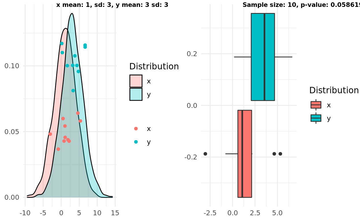
Two normal distributions, different mean, large variance
In this scenario the original formulation of boxplot intuition aligns with the t-test. Both respect the large variance and the small sample size concluding that we probably don’t have enough information to support the radical hypothesis2. Interestingly our refined rule actually gets the “truth” correct - the two samples come from different distributions. But to quote Judas, “what is truth”?
x_mean <- 1
y_mean <- 3
x_sd <- 3
y_sd <- 3
x <- rnorm(1000, mean = x_mean, sd = x_sd)
y <- rnorm(1000, mean = y_mean, sd = y_sd)

n <- 10
x_samples <- sample(x, n)
y_samples <- sample(y, n)

pop <- population_plot(x,y) %>%
  add_samples(x_samples, y_samples)
box <- boxplot(x_samples, y_samples)

test <- t.test(x_samples, y_samples)

label1 = sprintf("x mean: %d, sd: %d, y mean: %d sd: %d", x_mean, x_sd, y_mean, y_sd)
label2 = sprintf("Sample size: %d, p-value: %g", n, test$p.value)
ggarrange(pop, box, labels = c(label1, label2), font.label = list(size = 8))
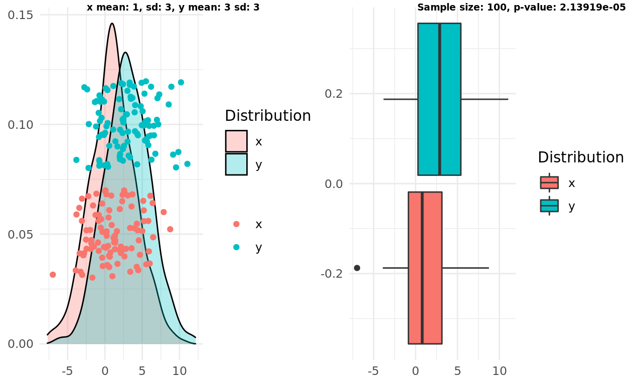
Two normal distributions, different mean, large variance, larger n
Finally, I repeat the test above but increase the sample size. In this case everything flip flops, the test correctly supports the alternative hypothesis that the distributions are different. Both formulations of the boxplot intuition fail. The boxplot intuition fails to increase its “confidence” based on the larger sample size.
x_mean <- 1
y_mean <- 3
x_sd <- 3
y_sd <- 3
x <- rnorm(1000, mean = x_mean, sd = x_sd)
y <- rnorm(1000, mean = y_mean, sd = y_sd)

n <- 100
x_samples <- sample(x, n)
y_samples <- sample(y, n)

pop <- population_plot(x,y) %>%
  add_samples(x_samples, y_samples)
box <- boxplot(x_samples, y_samples)

test <- t.test(x_samples, y_samples)

label1 = sprintf("x mean: %d, sd: %d, y mean: %d sd: %d", x_mean, x_sd, y_mean, y_sd)
label2 = sprintf("Sample size: %d, p-value: %g", n, test$p.value)
ggarrange(pop, box, labels = c(label1, label2), font.label = list(size = 7))
Non-normal
Next I ran a simple set of scenarios to see how the intuition holds up if the true distributions are not normal. In these cases I compared the boxplot intuition against the Mann-Whitney U Test.
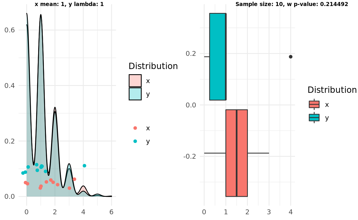
Two poisson distributions, same lambda
In this scenario I tested to see if the intuition and the test would correctly identify two samples coming from the same distributions. Both correctly failed to support the alternative hypothesis.
x_mean <- 1
y_mean <- 1
x <- rpois(1000, lambda  = x_mean)
y <- rpois(1000, lambda  = y_mean)

n <- 10
x_samples <- sample(x, n)
y_samples <- sample(y, n)

pop <- population_plot(x,y) %>%
  add_samples(x_samples, y_samples)
box <- boxplot(x_samples, y_samples)

test <- wilcox.test(x_samples, y_samples)

label1 = sprintf("x mean: %d, y lambda: %d", x_mean, y_mean)
label2 = sprintf("Sample size: %d, w p-value: %g", n, test$p.value)
ggarrange(pop, box, labels = c(label1, label2), font.label = list(size = 7))
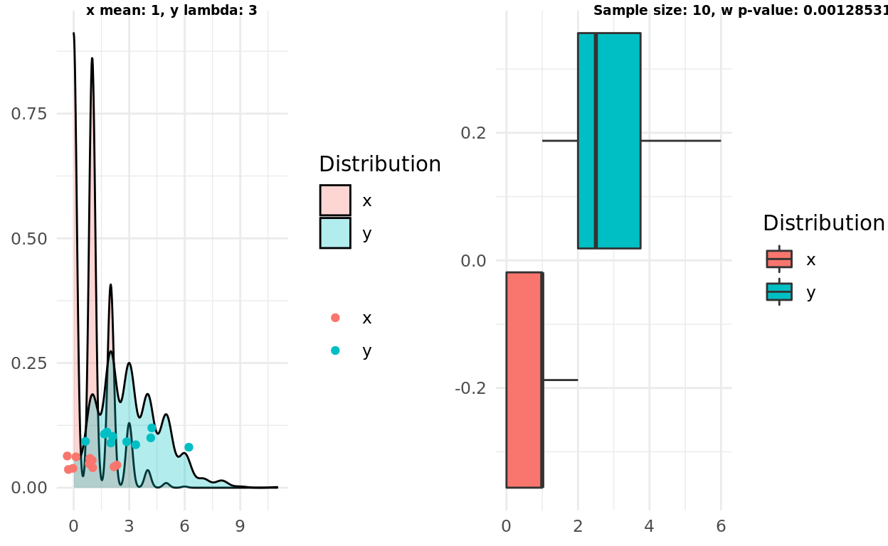
Two poisson distributions, different lambdas
Using samples from different distributions didn’t fool the test or the intuition either!
x_mean <- 1
y_mean <- 3
x <- rpois(1000, lambda  = x_mean)
y <- rpois(1000, lambda  = y_mean)

n <- 10
x_samples <- sample(x, n)
y_samples <- sample(y, n)

pop <- population_plot(x,y) %>%
  add_samples(x_samples, y_samples)
box <- boxplot(x_samples, y_samples)

test <- wilcox.test(x_samples, y_samples)

label1 = sprintf("x mean: %d, y lambda: %d", x_mean, y_mean)
label2 = sprintf("Sample size: %d, w p-value: %g", n, test$p.value)
ggarrange(pop, box, labels = c(label1, label2), font.label = list(size = 7))
Conclusions
On the whole, I think the boxplot intuition isn’t awful. Unless twitter throws a revolt I may even stick with it.
The biggest failure I observed is respecting sample size. The boxplot intuition does not increase if the sample size is bigger, nor does it always reflect the uncertainty in a small sample.
I was also pleasantly surprised that the intuition also held for at least one non-normal distribution.
Natural Next Steps
Run more simulations.
Attempt different non-normal distributions.
Look into multi-category testing.